

|
The point of this page is to tell you whether your internet provider, your software, and hardware are conspiring to take away from perfect viewing and enjoying Black and White ArtZone.
Make your screen wide enough to see both arrows on this line:
The Image below should appear as a rainbow starting and ending with red.
The following image is not a smooth transition. If you have only limited colors, the above rainbow would look something like this:
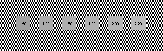
Below are some boxes, one should be absolute black. Nothing on your monitor should be darker than the black box. Look at the black border around your monitor. It should be as black as that box. And nothing should be lighter than the white box. The gray boxes and the white box should have no tint to them. No pink or blue.
Step back from your monitor.
How did you do ?The above page is copyrighted to the photographer © Stanley Rowin, who gave his permission for this presentation. If you need any more assistance "tweeking" your screen, you can reach at or you can visit his web site at Stanley Rowin Photography ——————————
Other interesting sources about Gamma corrections: |


Copyright © Black and White Art Zone . All rights reserved.